I'm not sure if anyone of you feel the same as I do but ever since LD revamped their site, it's been harder to browse and shop. Unlike the old site, I can no longer view all the contents of a set with one click. The preview on the new site only shows a maximum of 4 images of what the set actually includes. Most of the time there are a lot more that comes with the set. In order to see what the set really contains, you have to spend time and click through the preview box within that product listing.
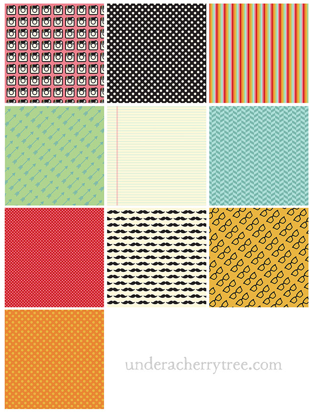
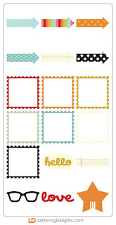
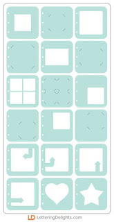
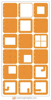
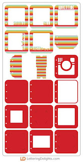
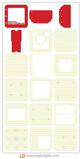
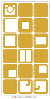
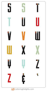
While I was looking at the latest release, it dawned upon me that I could make it easier for y'all to browse. So I took the following screenshots for you from their site. The only exception is the Instalove Paper Pack. The screenshot from the LD store is too small so I am posting larger images by using the set that I downloaded. Now you can just scroll down this post and you will see at a glance what each of the set in Instalove contains!
It took me some time to grab all the screenshots manually. There are 18 preview pages just for the Instalove - Album - PR set alone! If you see any mistakes, please let me know so I can fix it. As I am doing this manually, please double-check the contents of the files on the LD site yourself before completing your purchase.
I think you'll find this useful.
=====================================
CLICK HERE TO SEE INSTALOVE IN THE LD STORE.
Instalove - PP
Instalove - Frame - PR
Instalove - Elements - GS
Instalove - Elements - CS
Instalove - CA
Instalove - Album Box - PR
Instalove - Album Box - CP
Instalove - Album - PR
Instalove - Album - CP
Instalove - AL


















Thanks so much for your hard working in putting this together. My eyes thank you too!
ReplyDeleteHugs,
Carmen L
Agreed. I liked browsing through the old LD site better. These screenshots help a lot. For somebody like me who gets dizzy quickly, this is very convenient. Thank you. I think LD should just do it this way, actually. Browsing their site would be less of a pain in the butt.
ReplyDeleteI haven't browsed there since they revamped. Too annoying. I just pick up the free stuff and leave it at that. Too bad since I used to really enjoy their designs. I look to you for suggestions and then I can go directly to them and buy.
ReplyDeleteI agree with Donna above only half the time I don't even bother with the freebies and I own a lot of LD designs. I'm also disappointed the LD graphic menu on MTC no longer works. Browsing thru the designs I own helps me decide what I want to use on a project.
ReplyDeleteThank you Jin for your hard work. I don't visit the LD site much anymore. I think it's quite annoying.
ReplyDeleteI agree, too. The old site was much more navigable. I also am annoyed that they don't send you a 25% coupon code when you order.
ReplyDeleteEvelyn
Thank you, Jin. I don't like the new site either. Very hard to browse categories anymore. I hate buying anything when I can't even see everything that I would be getting.
ReplyDeleteThat was so nice of you, Jin! Thank you for your time and efforts on behalf of your readers! I don't understand why LD does not want to make sure their customers can see what they are buying!
ReplyDeletePS-I will comment here about your facebook posting, as I do not have a fb account! While I appreciate your efforts very much, it does not seem like a valuable use of your time. I would rather see projects you make using the bundles, and then I can see what is in them! Most of my LD purchases have been from seeing what you do with their products. So many times, there was a cute animal or design that I never realized was there!! I don't know if they give you free product, but they certainly should!!
DeleteThank you Jin, this is very generous of you. I was so excited when the new site went up, I thought we would have a faster, easier experience. Nearly a year later, I no longer even visit, unless it's to download product I already own. Before too long, I'm going to get all of my files off their site as I'm very afraid they will eventually fail and I do not want to lose the files I own.
ReplyDeleteThere is quite a bit in this set. beautiful.
ReplyDeleteSo glad to find that I am not the only one not liking the new site! I was a regular purchaser before, but find I don't care for what I CAN preview & just have quit bothering. Reading the fellow posters, I do pray they have developed a new set of clients & that someone over there will see this thread & take it to heart - I'd hate to see them go under!
ReplyDeleteI don't like the new site either. Thanks for doing all the work for us!
ReplyDeleteI don't like the new site either. Thanks for doing all the work for us!
ReplyDeleteI would have to agree that the new site design has decreased my interest in and interaction with LD. Here's what I miss most: being able to connect to LD via MTC;knowing instantly whether or not I've already purchased a given item; and being able to see an entire collection on-screen at one time. I, too, think I should make sure I've downloaded everything, just in case. For me, YOUR SITE is THE PLACE TO GO for inspiration, whether it's with LD products or otherwise. Because of YOUR IDEAS and superior execution, I've made purchases from LD I might not have otherwise considered, and in turn have tapped into new creative insights from following YOUR LEAD. Thank you, Jin, for your awesomeness!
ReplyDeleteI don't like the new site either. I'm glad to hear I'm not the only one. I used to buy a few things every month but haven't for awhile because it's too hard to browse. I also hate that I can't connect with MTC anymore. How hard can it be to fix the connection?
ReplyDeleteThis comment has been removed by the author.
ReplyDeleteThank you Jin! I also agree that the new site is FAR less user-friendly. I feel it is infinitely more difficult to do targeted searches, especially among items that I already own. This, plus the new fee, has resulted in a DRASTIC reduction in the number of purchases that I have made.
ReplyDelete