================================
This is Part 2 of the my Convert a Dingbat to Layered Image tutorial.
Please click HERE to see Part 1.
================================

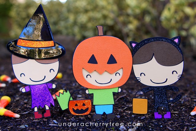
In part 1 of my dingbat tutorial, I showed you how to bring a simple character from the free MTF Sweet Halloween Dings onto the Silhouette Studio virtual mat and convert it into a cuttable file with layers. In today's post, I will explain how you can convert a slightly more complicated image, particularly the costumed kids.
I had previously demonstrated how you can make the layers of a pumpkin from the MTF Sweet Halloween Dings file. To recap, in Silhouette Studio, just do the following 5 steps:
1. Type the text,
2. "Ungroup" the image
3. Use "Release Compound Path" to separate the shapes
4. Drag out the base layer
5, Use "Make Compound Path" to make the face layer.
 |
| as shown in Part 1 of my dingbat tutorial |
 |
| as shown in Part 1 of my dingbat tutorial |
Modifying the pumpkin was easy because there are only two layers to it- a base and a face. To convert the costumed kids, an additional step is required before you can drag out the base.
As illustrated in the screenshot above, in order to make the base layer, first select the largest shape and the "hole" between the treat bag and its handle (both shapes are indicated above with a blue outline). Right-click and "Make Compound Path". You can now drag out the base layer.
For the Mummy, there are two ways of making the layered image. You can either have a white base (with a black top layer) or a black base (with a white top layer).
I compared both methods.
I started with the black top/white base. Cutting the top layer was interesting as it was super intricate. My Cameo had no problem cutting the 4" tall layer out. I used Michaels' Recollections brand of cardstock and cut with the setting of Blade 3, Thickness 22, Speed 3. The layer was cut out beautifully!
 |
| Method 1: black top/white base |
Gluing the black over the white base may seem challenging but it is actually rather easy with the use of a glue pen. However, I thought that the finished assembled piece looked a little flat. I decided I would try cutting it the other way around, using white cardstock for the top layer and black for the base, to see if it looks a little more interesting.
 |
| Method 2: white top/black base |
Since there are so many pieces that make up that top (white) layer, I used washi tape** to remove the pieces from the mat so that they stay in position. I applied glue (again with my glue pen) to all the white parts at the same time and adhered the layers onto a black base. Once assembled, the washi tape is gently removed.
** Check the stickiness of your washi tape before using it as a transfer tape. If it is too sticky, it may not release the cutouts. To "de-sticky" your washi tape, just press it against a t-shirt (I used my jeans) once or twice. It should be sticky enough to hold the cutouts together but not so sticky that it will not release them when you are adhering the parts to the base.
Frankly, there isn't all that much difference in how the mummy look, whether with a white top/black base or vice versa. Personally I prefer the white top/black base because it doesn't look as perfect as the other option but you can use whichever method that you think is easier to cut and assemble.
I converted the Witch image in the same way as the Cat Girl mentioned in the beginning of this post. To make the Witch's hat stand out, I used Glossy Accents to add shine and dimension.
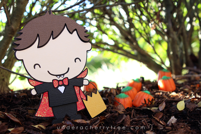
The Frankenstein Boy and the Vampire Kid were also converted into cuttables in the same way as the Witch and the Cat, but I did some further modification on the Pumpkin Kid.
In order to make the Pumpkin Kid look more like a cutting file in the style of an LD svg, I deleted away several parts of the dingbat and added some extra bases.
Here are the layers that I came up with. Can you tell what modifications I made?
Converting the dingbat into a LD-style cutting file is a lot more work but I thought that the final assembled piece looked much better. The hardest part was deciding which shapes to delete and which ones to retain and use to make the layers. I thought that the extra work was worth it as I really like how the finished piece looks- the kid looks like he is wearing a pumpkin head! Too cute! :-)
I hope that you enjoyed my dingbat tutorial. If you have not already downloaded the free MTF Sweet Halloween Dings, just click HERE to get it.


Thanks for a great tutorial, Jin!
ReplyDeleteDid you notice the Thin Font Sets (find them in the Cut-Its Section of the Lettering Delights store) are on sale for just $3.75 per set?? (regularly $15.00 a set)
Oh my gosh! I didn't notice that! Thanks for pointing that out, MizDenise!
DeleteThese are adorable. I love Halloween. Thanks for taking the time to teach us.
ReplyDelete