School is going to be out for Christmas break soon and it's time to get the teachers' gifts ready. I like to treat them to coffee and chocolates but I also like to add a personal touch to the gift. I thought that a handmade gift card holder would be a easy way to do that.
While I don't understand why Starbucks' red paper cups could warrant a controversy, I was happy to use that as an idea for my gift card holder. I will use the colors, Red and Gold, for the project as they always seem so festive when paired together. Red cardstock will work beautifully for the card base but how will I get the gold color onto the label? I had recently bought a Minc foiling applicator and I badly wanted to play with it but in the end, I decided to print-and-cut with the Silhouette Printable Gold Foil as it seemed so much easier.
The pack of printable foil did not come with much instructions. I looked for the recommended printer settings and was not able to find any on the packaging. So I used the settings for printing on regular printer paper. I was really disappointed when the printed sheet appeared somewhat smudgy and not sharp at all. On a whim, I decided to use the "Glossy Photo Paper" setting with my inkjet printer. This time the printing was perfect! Yippee!
 |
| I love how the distressed font looked on the foil! |
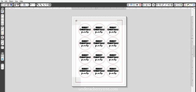
To kiss-cut (i.e., cutting the sticker labels out without cutting through the backing paper), I used the following settings:
Blade 2, Thickness 22, Speed 5
{ Please note: Every machine is different and what works for me may or may not work as well for you. Be sure to do a test cut before proceeding to cut the whole page. }
By the way, even though the original LD file for the gift card holder worked fine, I decided to make a slight adjustment to it. I made the insert a little broader and also added tabs to hold down the gift card.
I'm going to give each of the kids' teachers one of these gift cards and a box of Ferrero Rocher chocolates. I hope they like them.
-----
Files used:
Hot Chocolate for You - Cut Project
A Love of Thunder font (free)
PN Ma Kringle font


Jin what does the back look like?
ReplyDeleteThe red part is like an open-top envelope so that the front looks like the back except that I stuck a label on one side. Does that make sense?
DeleteHi Jin, I just purchased the file from LD and how did you make the card itself? Did you take the blue one with the heart and modify it?
ReplyDeleteI used File #4, the brown coffee cup. It's really simple to make because I only used layer 1 and layer 3, i.e. the white insert and the brown open-top envelope. :)
DeleteGot it ! Thank you makes sense now I was opening the file as jist the svg and not layers. Love this idea and can't wait to make it!
ReplyDeleteHello Jin, Where can I find the circle with the long and short dash inside circle and the words "thanks a latte"?
ReplyDelete